Infographics are all the rage these days in marketing departments. But why? What can an infographic do that other marketing tools can’t? And, just as importantly, what are the limits of infographics?
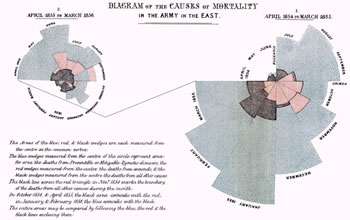 Most believe infographics are new, but early examples can be found as far back as the 17th century. Look at this infographic Florence Nightengale produced in 1857 to convince Queen Victoria to improve conditions in military hospitals. It is a little rough (I assume she used an early version of Illustrator), but I can see a cleaned-up version passing easily in today’s world.
In my view, there are three use cases for infographics:
 Visualizing something with imagery that is virtually impossible to explain with words. For example, we ‘see’ a trillion dollars in news articles all the time, but we don’t really ‘comprehend what it is. This infographic literally puts a trillion dollars in perspective. A billion is a lot of money, but a trillion is in a league of its own. Note: We didn’t create this – it comes from “Derivatives: The Unregulated Global Casino for Banks” http://demonocracy.info
 Showing a complex process. Want to learn how to dance ‘Gangham Style’? You could read a white paper on this, I suppose, but it is so much easier to just learn by looking at an infographic that shows you how it is done.
 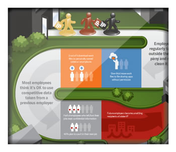 And, finally, an infographic is an excellent way to tell the story behind the numbers you get from a survey. Paragraph after paragraph explaining 38 percent said this while 42 percent said that can get old fast. An infographic can show you the story at a glance, while still presenting the details for those who want them. Here is a fun way to visualize the disconnect between employees and employers on the topic of intellectual property. This came from a survey we did for Symantec on the topic. We felt an infographic provided a fun way for readers to consume the message.
Of course, infographics are not always the answer. A brochure, for example, doesn’t really work as an infographic. The basic rule is this: Does an image tell your story more clearly, succinctly or more engagingly than words alone? If yes, then an infographic might make sense for you.
The next question is how to create a great infographic, but I will leave that for a future post …